CASE STUDY
Enhancing Operational Efficiency through Campaign Branding

OVERVIEW
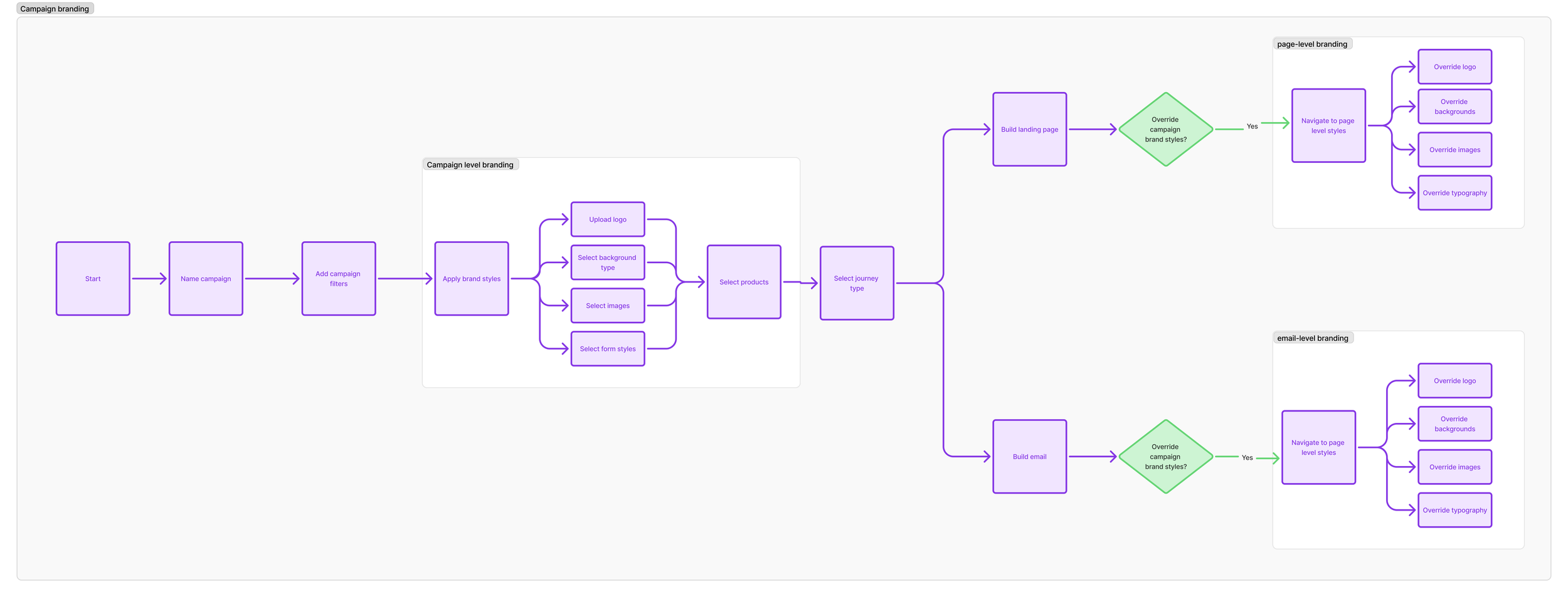
I streamlined campaign branding, allowing users to effortlessly apply brand elements across pages and emails. This promoted self-service and boosted operational efficiency.
Reduced the time spent on campaign creation by 70%
SUCCESS METRICS
100% adoption from brands that requested the feature
PROBLEM
The current platform limited users to applying brand styles on a per-page or per-email basis, rather than across entire campaigns. This restriction forced campaign creators to manually adjust branding for each individual page and email, making the process tedious, time-consuming, and prone to inconsistencies across campaigns.
USER GOALS
BUSINESS GOALS
Efficiency: Boost user efficiency by reducing manual work, ensuring consistency, and speeding up campaign creation.
Empowerment: Empower users to establish and manage brand styles universally across all emails and pages within a campaign.
User experience: Ensure a seamless, automatic application of brand styles, enhancing the user experience.
Self-service: Empower brands to manage their own styles, minimizing dependency on customer success teams and enabling scalable growth.
Efficiency & speed: Automate branding across emails and landing pages to accelerate campaign creation, especially for time-sensitive marketing.
Cost savings: Reduce manual work for customer success teams, lowering operational costs and reallocating resources to strategic initiatives.
USER STORY: CUSTOMER SUCCESS MANAGER
“As a Customer Success Manager, I want to apply my styles to an entire campaign so that all emails and pages are consistent, reducing manual work and ensuring a cohesive look.”

USER STORY: L’OREAL BRAND
"As a brand, I want to self-serve campaign creation by uploading assets and applying brand styles in the SoPost platform, so I can quickly customize campaigns without external support."


Discovery and definition
-
Conducted competitor analysis on platforms like Klaviyo, Typeform, and Mailchimp to explore branding features. Created a FigJam board with insights on best practices, standout elements, and areas for improvement, informing my design decisions.
-
Created as-is and to-be user journey flows to map out where this new campaign level branding would sit in the campaign creation process.
-
To gather stakeholder feedback, I created and presented two wireframe options:
Option 1: Detailed navigation with a real-time preview, allowing users to see brand styles applied live.
Option 2: A simplified, single-screen layout without a preview for a more streamlined and technically efficient solution.
-
I conducted interviews with Customer Success teams in the U.K. and U.S. to gather insights on campaign branding, style categorization, and preview options. Key questions focused on user preferences for editable features, preview functionality, and feedback on proposed designs.
Wireframe 2: Simplified layout without preview
This wireframe showed all brand categories on one screen, simplifying the user interface.
Advantages:
No preview feature made the build process simpler, faster and less complex.
Displayed all brand assets on one screen, making the process faster and more efficient.
Disadvantages: Without a preview, users may be unsure how the assets would appear in the final output.

Wireframe 1: Detailed navigation with preview
This wireframe grouped brand categories in the side navigation, with a preview showing real-time updates of brand styles on a page or email.
Advantages: Allowed users to easily see how changes affected the final output.
Disadvantages: Took more time, as users had to click "Next" to switch between categories.

Stakeholder interview findings
Identified essential styles: Logo, hero image, background, cover image, and campaign-level colours were key brand styles for the MVP.
Overriding capabilities: Ability to override brand elements and style buttons on a per-page and email-basis was still vital for building flexible campaigns.
Preview option: Was deemed as beneficial but not critical for initial launch. This was noted as a future improvement following customer feedback.
Ability to upload multiple brand assets: This was requested from the customer success team as another future enhancement.

Design and testing
-
Based on stakeholder feedback, I created a high-fidelity prototype focused on simplicity and efficiency. The design streamlined the user experience, making campaign branding easier to manage.
Key features included:
A unified page for brand categories, enabling quicker updates.
Logo upload for consistent branding.
Customizable background options and image uploads for hero and cover images.
Font and form styling options for full brand customization.
This design reduces complexity and enhances operational efficiency for users.
-
Throughout the design process, I worked closely with the engineering team, sharing feedback and gathering input on which styles to include at the campaign level. This collaboration ensured the final design was both user-friendly and technically feasible.
Design simplicity: A simplified design approach made the feature easier to use and quicker to implement.
Technical feasibility: Features like styling input fields were selected for their ease of implementation, enhancing user experience while considering technical constraints in mind.
Release: In order to provide users with immediate value, we decided to release each brand style one at a time. This allowed time to QA each brand style to ensure there were no issues.
-
To ensure the new campaign branding feature met user needs, I conducted user testing sessions with the customer success team using the high-fidelity prototype. The goal was to test usability and gather feedback on the feature’s effectiveness for campaign branding tasks.
Process:
Scenario: Participants applied brand styles for a fictional brand (Cara Beauty) to a campaign, including uploading assets and setting brand elements.
Tasks: Participants navigated the interface, applied styles, and reviewed their work.
Observation: I observed five participants, noting any challenges or areas for improvement.
Iteration: I iterated on the designs based on the feedback received.
ENHANCEMENTS TO EMAIL AND PAGE BRANDING
As part of this project, I identified issues with the existing process for overriding email and brand styles in the campaign builder. I also wanted to integrate the new campaign categories within email and page branding to make the end-to-end journey more intuitive.
Enhanced navigation for overriding brand styles on pages and emails

The process for overriding brand styles on emails and pages was confusing and inefficient, with issues like:
Poorly categorized and labeled brand styles
Incorrect components for applying styles e.g. dropdown menu to select between colour or page instead of a toggle button (as only 2 options to select).
Limited email branding options. Users could only override the background colour and font family for emails.
Nested tabs in the UI is bad practice and made it difficult to navigate.

Problem
Solution
Streamlined categories using consistent naming conventions used in campaign branding and incorporating icons.
Replaced nested tabs with accordion menus for better usability
Used the correct components and labels for easier style application
Applied all brand styles to emails for flexibility.